

In 1970, the NFL and AFL cooperated in a historic merger that created what we know today as the modern NFL. As part of this merger, the NFL decided to add two expansion teams, opening up a bidding war for cities around America to compete for a professional football team.
One of those cities, led by the Nordstrom family, was Seattle. By 1975, Seattle was officially getting an NFL team and decided to pay homage to their tribal influence and proximity to the sea, naming their team the Seattle Seahawks.
Through the decades, the team's name has not changed, but the logo has. All of them, to be honest, have been pretty good. But here is how the logo has evolved over the years.
All the Seattle Seahawks' logos in the franchise's history
1976 - 2001
The first rendition of the Seahawks logo was a royal blue and emerald green osprey head, which was stylized in Kwakwak'awakw art. The Burke Museum in Seattle actually has an interesting story on the logo, modeled after a Kwakawak'awakw transformation mask, which has remarkable similarities to the original Seahawks logo.
ICYMI, the native mask that inspired the #Seahawks logo is at @UW @burkemuseum starting Sat: [http://t.co/IrLbh6Synf] pic.twitter.com/mddD9Ti9kB
— Seattle Seahawks (@Seahawks) November 19, 2014
It's not surprising the Seattle Seahawks would draw influence from the Native American roots of the Pacific Northwest, but it's even less surprising they chose deep blue and bright green as their primary colors. Most of Washington itself reflects these colors in its own nature, whether it's the bright blue lakes, the deep blue coastal waters, or the vividly green trees across the great evergreen forests.
The royal blue, bright green Native American osprey head was placed on a silver shell helmet, which, as far as I know, was only silver because it was the 1970s and it looked really cool. This logo was brought back in 2023, as the Seahawks finally donned their throwback uniforms, which received incredible reviews from the NFL world.
2002 - 2012
In 2002, the Seattle Seahawks moved from the AFC West to the NFC West, and in doing so, moved into a brand new stadium -- Qwest Field, known today as Lumen Field. Along with the brand new division and brand new stadium, the Seahawks unveiled a brand new logo. The Kwakwak'awakw osprey got a sleek new, modernized design, and it became angrier.
#OTD in 2002: We revealed a leaner, meaner logo with new colors.
— Seattle Seahawks (@Seahawks) March 2, 2016
[https://t.co/FPol54OMQt] pic.twitter.com/fqCSVNEQNF
The Seahawk was no longer just royal blue and green, it introduced a softer blue and a deeper, darker blue on its logo. The bright green, a large part of the original design, shifted its way onto the angry eye of the bird, one of the coolest parts of the logo, in my opinion. And instead of staring at us, the viewer of the logo, with a wide eye, the Seahawk decided to face forward at its opponent with a scowl.
This new lean, mad, and more colorful bird found itself plastered onto a deep blue helmet after the color was chosen in a fan poll in 2002.
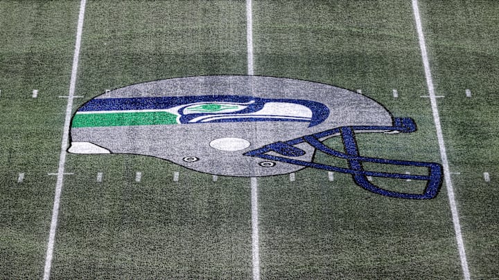
2012 - Present
In 2012, Nike took over as the uniform supplier for the NFL and gave the Seahawks a dramatic new uniform. However, the logo stayed relatively unchanged.
The main difference between the present logo from the 2002 logo is the back left portion of the osprey head. What was once a light blue color evolved into a light shade of grey, known as wolf grey. Wolf grey was a new color integrated into the Seahawks logo and uniform, but the blue and bright green remained mainstays from their previous design.
Helmet fitting day. pic.twitter.com/vs33hShqeM
— Seattle Seahawks (@Seahawks) October 24, 2023
The bird is still sleek and still angry, but it still serves as a reminder for Washington, and the entire Pacific Northwest for that matter, that the Native American influence will never go out of style in that region of the country. In my biased opinion, the Seahawks have one of the greatest logos in the NFL. Not only have the designs always looked nice, but they pay homage to the history of the region and the art and culture that shaped Seattle today.
Honorable Mention: 2017 alternate logo
The Seahawks debuted a new alternate logo and it's...interesting https://t.co/DWw7hrLBrI pic.twitter.com/gBZnWSvpFG
— Bleacher Report (@BleacherReport) September 6, 2017
In 2017, the Seahawks introduced an alternate logo, which was never actually used by the team and quickly disappeared from the Pro Shop after that year. I must admit I have a tee shirt with this logo on it because I unapologetically like it.
Essentially, it was the modern Seahawks logo mirrored on both sides to create the illusion of looking at the osprey head-on. It didn't get fantastic reviews and I was likely the only person on Earth to own a piece of merchandise featuring this logo, but the Seahawks tried something new. For the first time in franchise history, the osprey had two eyes, which is definitely unique.